

The Big 10 - Ugliest Uniforms in NHL History
Greetings, and welcome to the Big 10, a feature you will see throughout the offseason and into 2010-2011. What we're doing here is featuring the best (and worst) the NHL has to offer.
Ugliest uniforms is really one of my favorite conversation starters, and something I felt would be a good start. But bear in mind that this is about you as well. If you have something to add, or have your own topic you want to see covered, comment me here on the page or at mooseduncan9@gmail.com. I'll look forward to hearing from you.
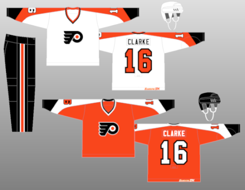
#10 - Philadelphia Flyers (1981-1982)
Ok, the reason this made the list wasn't for the jersey. We don't pick on anything Flyers here on the Grindin' blog. Fandom aside, I love the Flyers jersey, in fact all the incarnations of the Flyers jersey appeal to me. It's them damn pants that kill me. In the '81-'82 season and the '82-'83 season, the Flyers experimented with Cooperalls, a long length alternative to hockey shorts and shells. They scream community service uniform.
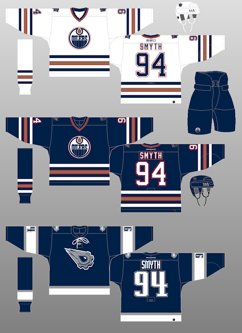
#9 - Edmonton Oilers (2001-2007)
The Oilers are only 30 years old, but are definitely one of the storied franchises in NHL history. Five Stanley Cups, Wayne Gretzky, Mark Messier, we can go on and on. The team logo. Timeless! With the exception of a little color darkening, everything remained the same until 2001, when Edmonton debuted the oil spill tribute jersey. We have a color and font change with a totally new logo. A cog. One, single cog. With oil coming out of it. I doubt the good folks of the Louisiana coast like it. I don't either.
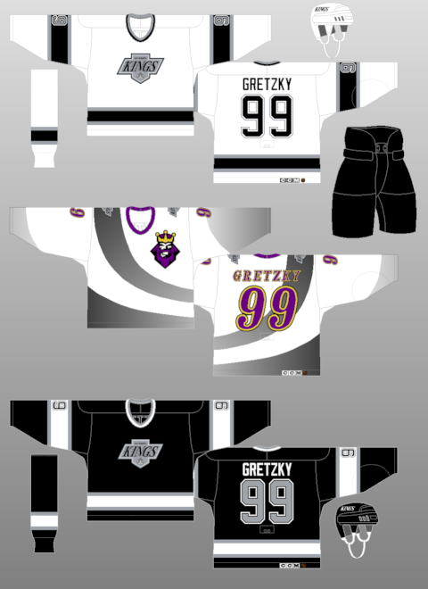
#8 - Los Angeles Kings (1995-1996)
Have it your way, right away with this horrid alternate, used only for the 1995-1996 season (thankfully). I think this thing is the reason that Wayne Gretzky high tailed it for New York. The Kings had a solid look with the black and silver, then ruined it with this purple and yellow train wreck.
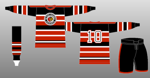
#7 - Chicago Blackhawks (1937-1938)
This jersey should have came with a warning label. "Prolonged exposure can cause seizures". There is nothing good about this jersey. Tons of stripes, silly looking little logo, bad colors. Plus, it's the Blackhawks. We're not allowed to like anything of theirs until the series is over anyway!
#6 - California Golden Seals (1970-1971)
Tell me what the hell that logo is supposed to be, and you win a prize. Tell me how blue and green go together, you can trade it in for a bigger one. This is just a personal thing, as I'm sure some of you love this look. To me, it's like AIDS spread on a bagel. This team died a slow death, and with that sweater, I'm cool with that.
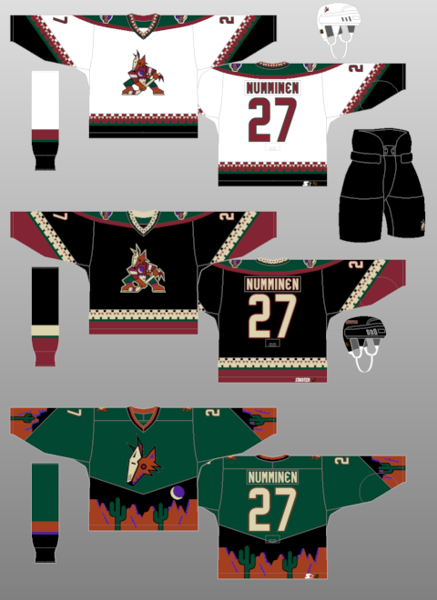
#5 - Phoenix Coyotes (1998-1999)
If Dr. Timothy Leary designed a hockey sweater, it would look just like this. That alternate jersey is just scary. You got half a coyote head and a desert scene. It looks alot like the desert vomited on fabric. Just absolutely disgusting, in a fun way.
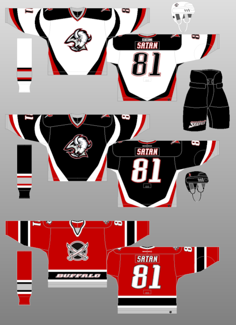
#4 - Buffalo Sabres (2000-2005)
Kind of lost on this one. Usually I can pick out one jersey and be like, "hey, that sucks". Not here. The home and road jerseys have a pissed off goat with horns on the front, and the alternate is a red light that says Buffalo on it, just in case you forgot where you are. Bad looks, bad bad looks.
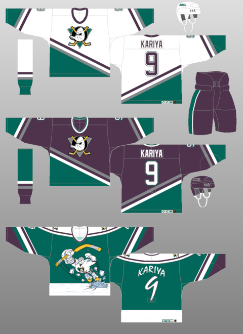
#3 - Mighty Ducks of Anaheim
Walt Disney's ghost hates hockey after seeing this. The standard jerseys are bad colors, but not DEFCON 5 like the alternate is. Who is that little, heroic looking man? Why, it's a bird...no yeah just stop right there. It is a bird. It's a duck, done up like a Superman. what else do I have to say?
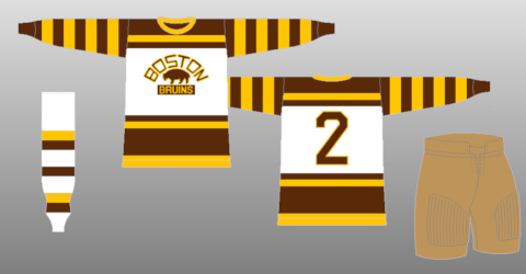
#2 - Boston Bruins (1926-1931)
I'm gonna keep this short. Snobs wear khaki, fat people look bad in stripes, brown is poop, yellow is pee. So this uniform is a fat snob losing his bowels on ice. See, that was easy, right?
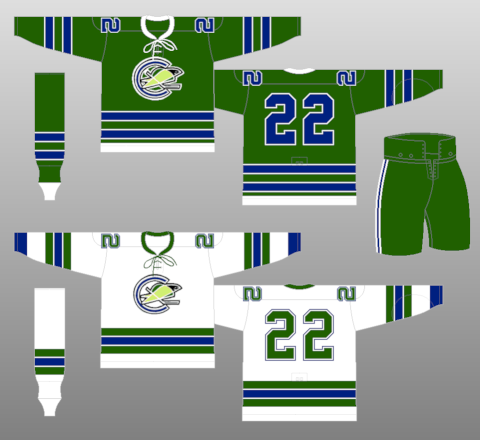
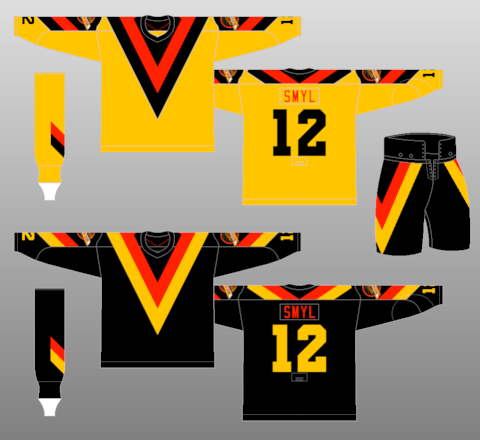
#1 - Vancouver Canucks (1978-1979)
It don't get no worse (or better depending on perspective) than this. In my honest opinion, Vancouver has never had an attractive set of duds, but this brown, orange and yellow disco disaster is just terrible. This set is widely recognized as the ugliest uniform in NHL history, and the Grindin' blog isn't gonna argue either.
As always, I welcome your input. I love being told i'm wrong. If you want to take a look at the uniforms yourself, head over to www.nhluniforms.com
Later!
Ugliest uniforms is really one of my favorite conversation starters, and something I felt would be a good start. But bear in mind that this is about you as well. If you have something to add, or have your own topic you want to see covered, comment me here on the page or at mooseduncan9@gmail.com. I'll look forward to hearing from you.
#10 - Philadelphia Flyers (1981-1982)
Ok, the reason this made the list wasn't for the jersey. We don't pick on anything Flyers here on the Grindin' blog. Fandom aside, I love the Flyers jersey, in fact all the incarnations of the Flyers jersey appeal to me. It's them damn pants that kill me. In the '81-'82 season and the '82-'83 season, the Flyers experimented with Cooperalls, a long length alternative to hockey shorts and shells. They scream community service uniform.
#9 - Edmonton Oilers (2001-2007)
The Oilers are only 30 years old, but are definitely one of the storied franchises in NHL history. Five Stanley Cups, Wayne Gretzky, Mark Messier, we can go on and on. The team logo. Timeless! With the exception of a little color darkening, everything remained the same until 2001, when Edmonton debuted the oil spill tribute jersey. We have a color and font change with a totally new logo. A cog. One, single cog. With oil coming out of it. I doubt the good folks of the Louisiana coast like it. I don't either.
#8 - Los Angeles Kings (1995-1996)
Have it your way, right away with this horrid alternate, used only for the 1995-1996 season (thankfully). I think this thing is the reason that Wayne Gretzky high tailed it for New York. The Kings had a solid look with the black and silver, then ruined it with this purple and yellow train wreck.
#7 - Chicago Blackhawks (1937-1938)
This jersey should have came with a warning label. "Prolonged exposure can cause seizures". There is nothing good about this jersey. Tons of stripes, silly looking little logo, bad colors. Plus, it's the Blackhawks. We're not allowed to like anything of theirs until the series is over anyway!
#6 - California Golden Seals (1970-1971)
Tell me what the hell that logo is supposed to be, and you win a prize. Tell me how blue and green go together, you can trade it in for a bigger one. This is just a personal thing, as I'm sure some of you love this look. To me, it's like AIDS spread on a bagel. This team died a slow death, and with that sweater, I'm cool with that.
#5 - Phoenix Coyotes (1998-1999)
If Dr. Timothy Leary designed a hockey sweater, it would look just like this. That alternate jersey is just scary. You got half a coyote head and a desert scene. It looks alot like the desert vomited on fabric. Just absolutely disgusting, in a fun way.
#4 - Buffalo Sabres (2000-2005)
Kind of lost on this one. Usually I can pick out one jersey and be like, "hey, that sucks". Not here. The home and road jerseys have a pissed off goat with horns on the front, and the alternate is a red light that says Buffalo on it, just in case you forgot where you are. Bad looks, bad bad looks.
#3 - Mighty Ducks of Anaheim
Walt Disney's ghost hates hockey after seeing this. The standard jerseys are bad colors, but not DEFCON 5 like the alternate is. Who is that little, heroic looking man? Why, it's a bird...no yeah just stop right there. It is a bird. It's a duck, done up like a Superman. what else do I have to say?
#2 - Boston Bruins (1926-1931)
I'm gonna keep this short. Snobs wear khaki, fat people look bad in stripes, brown is poop, yellow is pee. So this uniform is a fat snob losing his bowels on ice. See, that was easy, right?
#1 - Vancouver Canucks (1978-1979)
It don't get no worse (or better depending on perspective) than this. In my honest opinion, Vancouver has never had an attractive set of duds, but this brown, orange and yellow disco disaster is just terrible. This set is widely recognized as the ugliest uniform in NHL history, and the Grindin' blog isn't gonna argue either.
As always, I welcome your input. I love being told i'm wrong. If you want to take a look at the uniforms yourself, head over to www.nhluniforms.com
Later!

0 Response to "The Big 10 - Ugliest Uniforms in NHL History"
Post a Comment